Ready to make your shop stand out on the forum? A well-designed layout can really set the tone for your business, making it visually appealing and easy for art buyers/commissioners to navigate. Since wpForo uses HTML instead of BBCode, I’m going to walk you through creating a clean, professional-looking shop layout with banners, images, and tables to organize everything beautifully.
1. Create Your Shop Banner
Your banner is the first thing people will see, so it’s important to make a strong impression. You can use a free tool like Canva or Adobe Spark to design a simple yet eye-catching banner that reflects your shop’s vibe.
Once you have your banner image ready, upload it to an image hosting service (like Imgur or your forum's file uploader). Then, use the following HTML code to insert it into your shop:
<img src="YOUR_IMAGE_URL_HERE" alt="Shop Banner" style="width:100%; max-width:800px;">
Replace YOUR_IMAGE_URL_HERE with the direct link to your banner. The style part ensures the banner fits nicely, scaling it down if necessary.
2. Organize Your Shop with Tables
Tables are a fantastic way to organize your shop offerings, such as pricing, descriptions, and links to products. Here’s a basic HTML table template you can use to list your products neatly:
<h2 style="text-align:center;">Featured Products</h2>
<table style="width:100%; text-align:center; border-collapse:collapse;">
  <tr>
    <td style="background-color:#f4a460;">
      <img src="FEATURED_PRODUCT_IMAGE_1" alt="Featured Product 1" style="width:200px;">
      <p><strong>Product Name 1</strong></p>
      <p>$20.00</p>
    </td>
    <td style="background-color:#98fb98;">
      <img src="FEATURED_PRODUCT_IMAGE_2" alt="Featured Product 2" style="width:200px;">
      <p><strong>Product Name 2</strong></p>
      <p>$25.00</p>
    </td>
    <!-- Add more cells with different background colors for additional products -->
  </tr>
</table>
Would look like:
Featured Products

Product Name 1 $20.00 |

Product Name 2 $25.00 |
- Replace FEATURED_PRODUCT_IMAGE_1 the image link for each product.
- Replace Brief description of Art Style with a description.
- Replace background-color:#f4a460 with whatever hex color you want.
- Change the Price to whatever you're charging.
The table will automatically size to fit the page, and you can add more rows to display more artwork! You can get pretty advanced with tables - check out this great reference guide by GetBootStrap.com! You can also use Word to HTML if you're a visual person.
3. Include Custom Graphics or Dividers
If you want to break up sections of your shop or highlight different categories, you can use custom dividers or graphics. Here's an example using an image as a divider:
<img src="DIVIDER_IMAGE_URL" alt="Section Divider" style="width:100%; max-width:800px;">

If you don’t have a divider graphic, you can create a simple one or use a free image from stock sites like Unsplash or Pixabay. Alternatively, you can use the built-in horizontal divider the forum provides:
It's not the fanciest thing in the world, but it divides content nicely!
4. Add Social Media Links and Contact Info
To make it easy for customers to reach out or follow you, add your social media links and contact details at the bottom of your shop:
<p>Follow me on:</p>
<a href="YOUR_INSTAGRAM_LINK" target="_blank">Instagram</a> |
<a href="YOUR_TWITTER_LINK" target="_blank">Twitter</a> |
<a href="YOUR_FACEBOOK_LINK" target="_blank">Facebook</a>

<p>For inquiries, contact me at: <a href="mailto:youremail@example.com">youremail@example.com</a></p>
Example:
Follow me on:
Instagram | Twitter | Facebook
For inquiries, contact me at: youremail@example.com
This simple section makes it easy for users to connect with you and stay updated on your latest products or promotions.
With HTML, you have so much flexibility to design a visually appealing and organized shop layout on Art Den. Banners, images, tables, and a bit of custom styling can all work together to make your shop stand out. Feel free to play around with different designs until you find something that feels just right for your style.
If you need any help tweaking your layout, feel free to reach out to the community, and happy shop building! 😊

For all intents and purposes, I've colored the cells so you can see the different styles of formatting 🤓
1. Basic Table Structure
The basic structure of a table in HTML includes four main elements:
- table: This is the outer container for the table.
- tr: This stands for "table row" and is used to define a row within the table.
- td: This stands for "table data" and defines a cell within a row.
- th: This stands for "table header" and is used to create header cells, usually with bold text by default.
Example:
<table> <tr> <th>Header 1</th> <th>Header 2</th> </tr> <tr> <td>Data 1</td> <td>Data 2</td> </tr> </table>
| Header 1 | Header 2 |
|---|---|
| Data 1 | Data 2 |
2. Border and Spacing
By default, tables in HTML have no borders. You can control spacing between cells with the cellpadding and cellspacing attributes.
Example:
<table border="1" cellpadding="10" cellspacing="0"> <tr> <td>Data 1</td> <td>Data 2</td> </tr> </table>
| Data 1 | Data 2 |
border="1": Adds a border around each cell - this does not work on our forum (for some reason). I'll let peeps know when we can have borders! <3
cellpadding="10": Adds padding inside each cell.
cellspacing="0": Removes space between cells.
3. Merging Cells (Colspan and Rowspan)
You can merge cells across columns or rows using colspan and rowspan.
Example:
<table border="1"> <tr> <td colspan="2">This cell spans two columns</td> </tr> <tr> <td>Cell 1</td> <td>Cell 2</td> </tr> </table>
| This cell spans two columns | |
| Cell 1 | Cell 2 |
In the example, the first cell spans two columns. You can also use rowspan to merge cells across rows.
4. Table Alignment
To align content inside the table cells, you can use text-align and vertical-align.
Example:
<table border="1"> <tr> <td style="text-align:center; vertical-align:middle;">Centered Text</td> <td style="text-align:right;">Right-Aligned Text</td> </tr> </table>
| Centered Text | Right-Aligned Text |
text-align:center Centers the text horizontally.- vertical-align:middle: Centers the text vertically within the cell.
5. Zebra Stripes (Alternating Row Colors)
For a better user experience, you can create "zebra stripes" where every other row has a different background color. This makes reading data easier.
Example:
<table border="1"> <tr style="background-color:#f2f2f2;"> <td>Row 1</td> </tr> <tr> <td>Row 2</td> </tr> <tr style="background-color:#f2f2f2;"> <td>Row 3</td> </tr> </table>
| Row 1 |
| Row 2 |
| Row 3 |
6. Table Width
By default, the width of a table adjusts to the content. You can set a specific width to control how wide the table should be.
Example:
<table border="1" style="width:100%;"> <tr> <td>Full-width table</td> </tr> </table>
| Full-width table |
| 50% width table |
Setting width:100% ensures the table spans the entire width of the forum post. Likewise, setting width:50% would set the table to be half the width.
These are some basic tips and tricks to make your tables in HTML both functional and visually appealing!
![]()
Option 1: Use the "My Media" in the post reply/topic creator
1. Click "My Media" and click "Add Files..."
2. Click the green "Add to post"
- This will insert your image as a thumbnail, and when users click on the thumbnail, it expands larger into a lightbox (click below as an example)
If you don't want to use the thumbnail-to-lightbox method, here is where some HTML will come in.
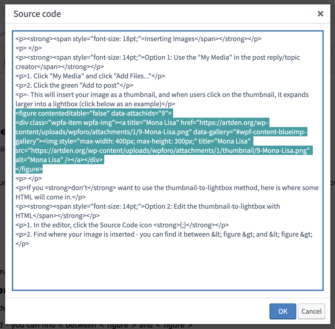
Option 2: Edit the thumbnail-to-lightbox with HTML
1. In the editor, click the Source Code icon {;}
2. Find where your image is inserted - you can find it between < figure > and < / figure >

The code should look something like this:
<figure contenteditable="false" data-attachids="9">
<div class="wpfa-item wpfa-img">
<a title="Mona Lisa" href="https://artden.org/wp-content/uploads/wpforo/attachments/1/9-Mona-Lisa.png" data-gallery="#wpf-content-blueimp-gallery">
<img style="max-width: 400px; max-height: 300px;" title="Mona Lisa" src="https://artden.org/wp-content/uploads/wpforo/attachments/1/thumbnail/9-Mona-Lisa.png" alt="Mona Lisa" />
</a>
</div>
</figure>
We can remove the figure and the div.
The img is where the image is actually showing - so what we'll want to do is copy the href link to the img link, like this:
Before
<a title="Mona Lisa" href="https://artden.org/wp-content/uploads/wpforo/attachments/1/9-Mona-Lisa.png" data-gallery="#wpf-content-blueimp-gallery">
<img style="max-width: 400px; max-height: 300px;" title="Mona Lisa" src="https://artden.org/wp-content/uploads/wpforo/attachments/1/thumbnail/9-Mona-Lisa.png" alt="Mona Lisa" />
After
<a title="Mona Lisa" href="https://artden.org/wp-content/uploads/wpforo/attachments/1/9-Mona-Lisa.png" data-gallery="#wpf-content-blueimp-gallery">
<img style="max-width: 400px; max-height: 300px;" title="Mona Lisa" src="https://artden.org/wp-content/uploads/wpforo/attachments/1/9-Mona-Lisa.png" alt="Mona Lisa" />
We can also remove the <a title line, as well as the < /a> at the end.
Now our HTML should look like this:
<img style="max-width: 400px; max-height: 300px;" title="Mona Lisa" src="https://artden.org/wp-content/uploads/wpforo/attachments/1/9-Mona-Lisa.png" alt="Mona Lisa" />
Now, what does the rest of this nonsense mean?
max-width: the maximum width you want your image to be - you can use width or height and it will scale proportionally!
max-height: the maximum height you want your image to be- you can use width or height and it will scale proportionally!
title: the title of this image
src: where the image is actually living
alt: alt text to help folks who are visually impaired or using screen readers.
A shortcut for inserting images
<img style="max-width: 400px; max-height: 300px;" title="TITLE" src="IMAGE_LOCATION_HERE" alt="DESCRIBES_IMAGE" />
Copy and paste this code into your Source Code icon {;} and replace the UPPERCASE with the appropriate words/links.

